International Loha Bhandar Pvt. Ltd.
To create a comprehensive branding strategy, including logo design and website development, to position their HR steel products as high-quality and trustworthy, while driving traffic and engagement.
International Loha Bhandar Pvt. Ltd. is a leading distributor of HR steel products, serving clients across NCR and Rajasthan. They partnered with Sunnyday Consulting to create a strong brand identity that would reflect their commitment to quality and trustworthiness. Sunnyday Consulting developed a comprehensive branding strategy, including a new logo design and website, to position the brand as a premium provider of HR steel products.
Task
Help ILBPL to create a strong and memorable brand identity that would position them as a high-quality and trustworthy distributor of HR steel products in Delhi NCR and Rajasthan.
-
Strategy
Sunnyday Consulting conducted market research and analysis to develop a branding strategy that highlighted the brand's unique value proposition and positioning, emphasizing their quality and trustworthiness in the competitive HR steel products market. This strategy included guidelines for brand usage across all marketing materials and touchpoints.
-
Design
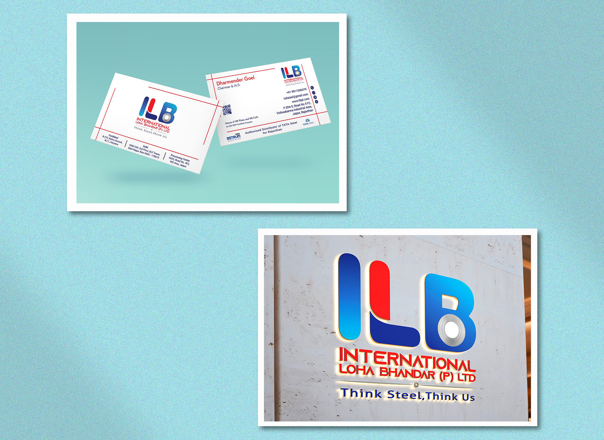
Developed a visually appealing brand identity that reflected International Loha Bhandar Pvt. Ltd.'s commitment to quality and trustworthiness. This included a new logo design that captured the brand's values and personality, as well as a comprehensive visual language for use across all marketing materials, including the website, and other collateral.
-
Production
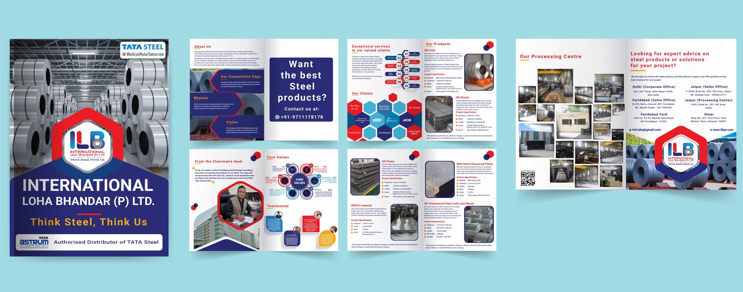
Produced all marketing materials in collaboration with International Loha Bhandar Pvt. Ltd., including the website, brochure, visiting cards and more. Ensure that all materials adhered to the established branding guidelines, maintaining a consistent look and feel across all touchpoints.
-
Platforms
Desktop, Android Tracked analytics and used data-driven insights to continually improve the brand's visibility and engagement with target audiences.


⬤ 01. Challenges
Challenges we faced while helping ILBPL included limited market research, competitive market, limited resources, and technical expertise.
CHALLENGES
We faced several challenges when helping ILBPL establish a strong identity in a crowded market. These include
Understanding the competitive landscape of the HR steel products industry.
Developing a brand identity that effectively differentiates the brand from competitors.
Ensuring that the brand identity accurately reflects the brand’s values and personality.
Producing high-quality marketing materials within budget and timeline constraints.
Maintaining consistency across all touchpoints and adhering to branding guidelines.
Driving traffic and engagement to the website and other digital platforms through SEO and PPC campaigns.
Measuring the success of branding efforts through analytics and tracking tools.
To overcome these challenges, we needed to conduct thorough research and analysis of the industry and target audience, develop a clear branding strategy, create a visually appealing and memorable brand identity, produce high-quality marketing materials, execute effective digital marketing campaigns, track and measure success through analytics, and continually stay informed of industry trends and best practices.

⬤ 02. APPROACH
Crafting a brand identity through market research and guidelines.
Using proper digital tools, our team was able to develop the perfect brand identity for ILBPL.
We took a research-driven and comprehensive approach to creating a brand identity for International Loha Bhandar Pvt. Ltd.
that included developing a clear branding strategy, producing visually appealing marketing materials, executing effective digital marketing campaigns, and continuously measuring and improving results.

| Primary #ED1C24 | ||
This red possesses the remarkable ability to command immediate focus, making it a potent tool for logo design. Beyond its visual impact, lava red conjures emotions of passion and vitality, infusing the logo with a compelling energy that resonates with audiences. The boldness of this color choice not only communicates confidence and strength but also propels a sense of urgency and action.
Lava Red
| Secondary #292C75 | ||
This serene shade, reminiscent of the deep ocean or a clear sky, possesses a calming and tranquil quality that resonates with audiences seeking reliability and stability. Lapis blue’s intrinsic association with wisdom and depth fosters a perception of professionalism and expertise, making it an astute choice for brands that aim to convey a refined image.
Lapis Blue
| Tertiary #3C63AE | ||
The choice of flat blue in logo design often conveys a professional and businesslike demeanor, making it a popular selection for companies aiming to establish a credible and enduring presence. The subtlety of flat blue harmonizes seamlessly with a wide range of industries, imparting a sense of reliability and sincerity that fosters strong brand connections.
Flat Blue
| Tertiary #02B4DC | ||
This vibrant yet serene shade of blue captures the essence of clear skies and tranquil waters, infusing a logo with a refreshing and positive energy. It is associated with creativity and forward-thinking and aligns seamlessly with our brand to project a modern and inventive image. We wanted to captivate vibrancy that resonates with audiences seeking both a sense of calm assurance and a hint of exciting potential.
Cerulean Blue
Typography
Typefase
Roboto Normal
Usage
Logo Font
Aà
Roboto Normal is chosen as the font due to its readability, versatility, digital optimization, system integration, modern aesthetic, global appeal, free licensing, consistency with branding, and community adoption. It was designed to be culturally neutral, allowing it to be suitable for a wide range of languages and writing systems. This feature makes it an attractive choice for brands with a global presence.
AaBbCcDdEeFfGgHhIiJjKkLlMmNnOoPpQqRrSsTtUuVvWwXxYyZz 0123456789
Typefase
Roboto Bold
Usage
Logo Font
The contrast between Roboto Bold and regular text helps create visual interest within a design. Brands can leverage this contrast to add variety to their branding materials while maintaining a consistent overall look and feel.
⬤ 03. Result
We created a comprehensive branding strategy, including logo design and website development, to position their HR steel products as high-quality and trustworthy, while driving traffic and engagement.

Testimonials
Best Practices
“I needed to efficiently establish a strong brand identity, positioning, and personality for our farm to kitchen concept and products. Sunnyday hit the ball out of the park with some highly creative out-of-the-box work, delivered quickly and cost-effectively. I'd highly recommend them to others looking to cut through the clutter and disrupt categories. A talented and nimble agency, I can confidently recommend them to clients in need of an effective advertising and marketing partner.”
MS. SHARADA SADULA
Founder - Saradas
Best Practices
"The Sunnyday team helped me with content for my digital channels. I am a Canadian realtor and the team was able to develop creative appealing material that resonated in my specific market. Communications were easy as they were available at virtually any hour that I needed to speak with them. They listened to my problems and as a result we were able to hit the mark quickly and accurately with the material that was posted."
MR. PETER VANSICKLE
Founder - Peter Vansickle
Best Practices
"Working with Sunnyday Consulting has been an absolute game-changer for Mirchi. Their unmatched marketing expertise and creative finesse have consistently brought our visions to life, surpassing expectations every time. Their exceptional talent in deciphering our needs, coupled with unparalleled client service, has made every project a resounding success. Beyond their impressive skill set, their consistent dedication has even led to prestigious award wins from esteemed marketing associations. Sunnyday Consulting isn't just a partner; they're an invaluable asset in our journey, and we look forward to more triumphs together. Keep up the good work!"
KARAN SHETTY
Project Head - MIRCHI

