Case Study
June 3, 2020
Bob SunRun
To create a new brand identity for BOB Sunrun 2.0 that would appeal to a broader audience and attract more sponsors.
Task
The objective of this project was to create a new brand identity for BOB Sunrun 2.0 that would appeal to a broader audience and attract more sponsors. The brand identity should convey the event's key messages, which include community, fitness, and fun. In addition to the brand identity, the organizing committee also wanted to create a range of creative services, including digital and on-ground event materials, to promote the event and engage participants.
-
Objective
Create a brand identity that conveys the event's key messages, which include community, fitness, and fun
-
Solution
Creating both digital and on-ground creatives keeping in mind the vision of the run
-
Production
For the creative services, we developed a range of materials to promote the event, including digital banners, influencer creatives, third party ticket website branding, event posters, flyers, and banners.
-
Platform
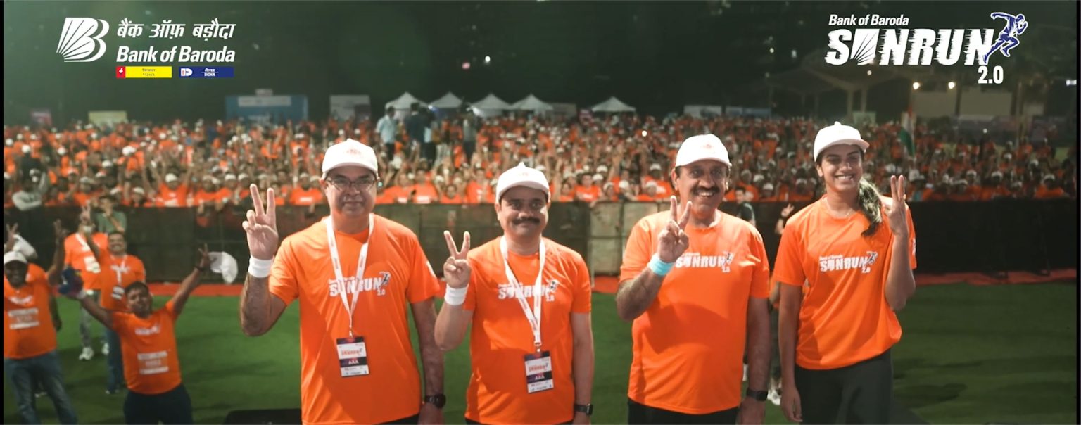
For on-ground event, we created a range of materials to engage participants, including event t-shirts, medals, and goodie bags. We also designed a start/finish line arch, stage design, photo op backdrop and all other branding elements required on the D Day.

⬤ 01. Challenges
Bob Sunrun 2.0 - a marathon event that aims to promote a healthy and active lifestyle, while also raising awareness and funds for a local charity.
Case Study – Bob SunRun Brand Identity, Creatives (Digital + On ground)
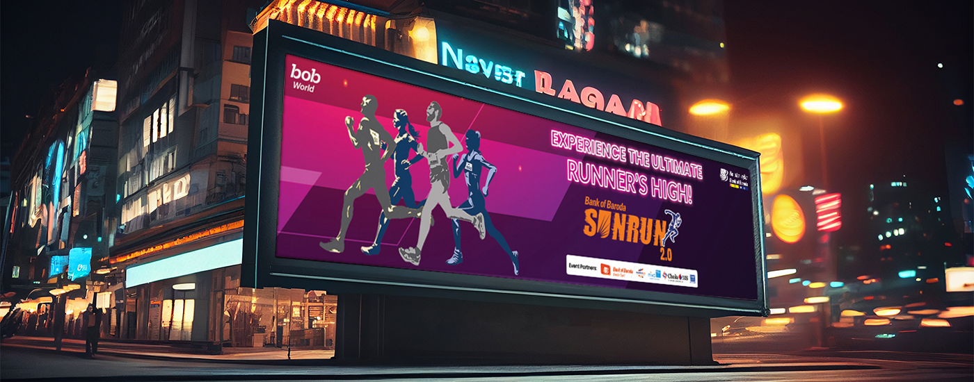
For the brand identity, we created a new logo that featured a stylized illustration of the rising sun mnemonic of Bank of Baroda, fused with the energy of a runner to illustrate the feeling of ultimate runner’s high. The illustration was designed to be both bold and playful, reflecting the event’s fun and inclusive nature. The logo was paired with a bright and vibrant colour palette, and a bold, modern typeface.
For the creative services, we developed a range of materials to promote the event, including digital banners, influencer creatives, third party ticket website branding, event posters, flyers, and banners.
For on-ground event, we created a range of materials to engage participants, including event t-shirts, medals, and goodie bags. We also designed a start/finish line arch, stage design, photo op backdrop and all other branding elements required on the D-Day.
⬤ 02. Experience
The event's goal is to attract a diverse group of participants, including runners of all skill levels, families, and community members. In order to achieve this goal, a strong brand identity and creative services were needed to create a cohesive and engaging event experience.
The first step in creating the brand identity for Bob Sunrun 2.0 was to develop a logo that would be both distinctive and representative of the event’s mission. The logo was designed to feature a stylized sun,
with the letters “BOB” incorporated into the design to represent the event’s name. The colors used in the logo were bright and vibrant, with a focus on yellow and orange to represent the sun and energy of the event.
| Primary #F37C20 | ||
| R 0 G 122 B 255 |
Mustard
| Secondary #FF5F1F | ||
| R 0 G 122 B 255 |
Orange
| Secondary #FFFFFF | ||
| R 0 G 122 B 255 |
White
| Tertiary #00000 | ||
| R 0 G 122 B 255 |
Moonlight Black
The colors used in the logo were bright and vibrant, with a focus on yellow and orange to represent the sun and energy of the event.
We paired the logo with a bright and vibrant colour palette, and a bold, modern typeface.
Grow brands through bold and strategic creative, focused on searching new ways to showcase user content on digital support and envisioning the future arts.
Typography
Typefase
Poppins
Usage
Tagline
Aa
We wanted a bold, and modern typeface that would appeal to both young and old audiences.
AaBbCcDdEeFfGgHhIiJjKkLlMmNnOoPpQqRrSsTtUuVvWwXxYyZz 0123456789
Typefase
Storm Bold
Usage
Logo
Our logo featured a stylized illustration of the rising sun mnemonic of Bank of Baroda, fused with the energy of a runner to illustrate the feeling of ultimate runner’s high.
Typefase
Storm ExtraBold
Usage
Logo
We used the Storm ExtraBold font to make sure that our logo stood out from the rest .
⬤ 03. Mobile Experience
The brand identity and creative services developed for Bob Sunrun 2.0 helped to create a cohesive and engaging event experience that attracted a diverse group of participants.

Testimonials
Best Practices
“I needed to efficiently establish a strong brand identity, positioning, and personality for our farm to kitchen concept and products. Sunnyday hit the ball out of the park with some highly creative out-of-the-box work, delivered quickly and cost-effectively. I'd highly recommend them to others looking to cut through the clutter and disrupt categories. A talented and nimble agency, I can confidently recommend them to clients in need of an effective advertising and marketing partner.”
MS. SHARADA SADULA
Founder - Saradas
Best Practices
"The Sunnyday team helped me with content for my digital channels. I am a Canadian realtor and the team was able to develop creative appealing material that resonated in my specific market. Communications were easy as they were available at virtually any hour that I needed to speak with them. They listened to my problems and as a result we were able to hit the mark quickly and accurately with the material that was posted."
MR. PETER VANSICKLE
Founder - Peter Vansickle
Best Practices
"Working with Sunnyday Consulting has been an absolute game-changer for Mirchi. Their unmatched marketing expertise and creative finesse have consistently brought our visions to life, surpassing expectations every time. Their exceptional talent in deciphering our needs, coupled with unparalleled client service, has made every project a resounding success. Beyond their impressive skill set, their consistent dedication has even led to prestigious award wins from esteemed marketing associations. Sunnyday Consulting isn't just a partner; they're an invaluable asset in our journey, and we look forward to more triumphs together. Keep up the good work!"
KARAN SHETTY
Project Head - MIRCHI
Let's get in touch,
we respond fast.
Ready to work together?
