SARADAS

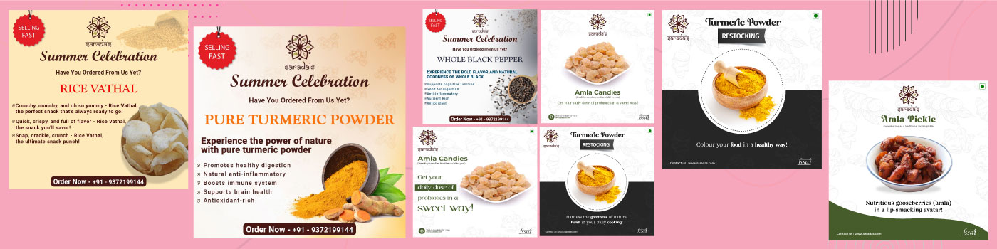
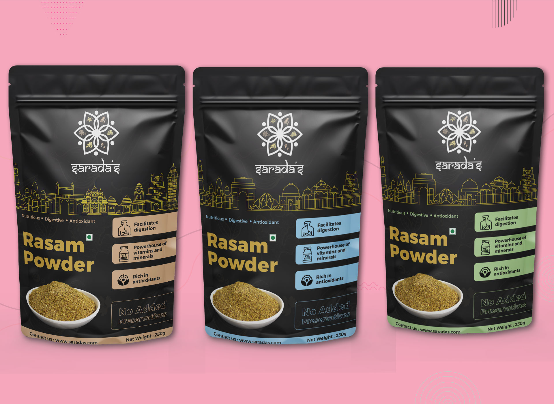
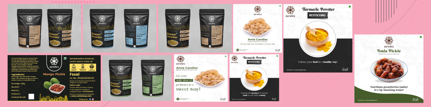
From conceptualizing to executing the brand design for a consumer goods brand that sells pickles, masalas, and other condiments aimed at middle-class urban Indian households. The brand positions itself as premium, authentic and traditional. Its visual identity as created by us features traditional Indian motifs and colors and is communicated through the logo and packaging. Saradas uses digital marketing campaigns, food expos, influencer marketing, and social media to promote its brand, resulting in increased sales and brand awareness.

Task

Help Sarada to establish a strong and recognizable identity in an overcrowded market to help increase brand awareness and drive sales.

  • Strategy

    To establish a strong brand identity, conduct market research, develop a differentiated strategy, create a visual identity, leverage influencer marketing, utilize customer feedback, and continuously refine the strategy.

  • Design

    Develop a unique brand identity system, including logo, color palette, typography, and packaging, that resonates with the target audience and stands out among competitors.

  • Production

    Develop brand website and launch advertising campaign

  • Platforms

    Desktop, Android

⬤ 01. Challenges

Challenges we faced while helping Saradas to establish in an overcrowded market: target audience, brand identity, and competition.

We faced several challenges when helping Saradas establish a strong identity in a crowded market. These include 

  • Competing with established brands, 
  • Understanding the target audience, 
  • Building a brand identity, 
  • Developing a marketing strategy, and 
  • Measuring success. 

We needed to develop a strategy that allows Saradas to stand out from the competition, resonate with the target audience, and communicate the brand’s unique positioning while effectively tracking success to ensure its marketing efforts are effective.

Color palette

Primary
#DDB185


is a neutral color that represents tradition, authenticity, and simplicity. It conveys a sense of elegance and sophistication. The use of beige in Saradas’ color palette suggests the brand values quality and heritage, and aims to create a refined and timeless brand image.

Sorrell Brown

Secondary
#FEE06C


is a warm and vibrant color that represents energy, optimism, and friendliness. It conveys a sense of playfulness and creativity. The use of yellow in Saradas’ color palette suggests that the brand aims to create a friendly and approachable brand image that appeals to a wide range of customers.

Pale Gold

Grey
#474748


is a cool and versatile color that represents stability, balance, and professionalism. It can also convey a sense of modernity and sophistication. The use of grey in Saradas’ color palette may suggest that the brand values reliability and professionalism, and aims to create a contemporary and minimalist brand image.

Charcoal Grey

Typography

Typefase
Samarkan Normal 

Usage
Headlines

The philosophy behind selecting the Samarkan Normal font for the Sarada logo is to create a unique and memorable visual identity that aligns with the brand’s personality and values, stands out in a crowded marketplace, and is well-suited to the brand’s Indian heritage by matching the Indian written script.

AaBbCcDdEeFfGgHhIiJjKkLlMmNnOoPpQqRrSsTtUuVvWwXxYyZz 0123456789

Typefase
Montserrat

Usage
Package Content

The Montserrat font's modern and clean style is meant to convey the brand's contemporary approach, while its legibility ensures that the package content is easy to read and understand, reflecting Sarada's commitment to quality, authenticity, and convenience.

Testimonials

Let's get in touch,
we respond fast.

Ready to work together?
Back

Leave a Reply

Your email address will not be published. Required fields are marked *